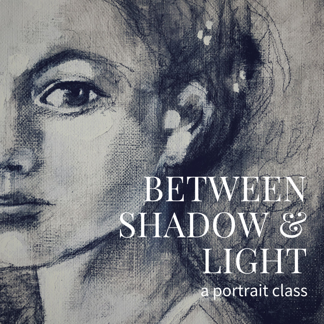
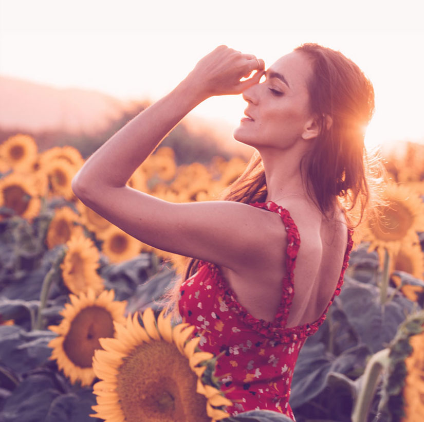
IVY NEWPORT
Studioworks
Journal
a letter from ivy
Welcome to Issue No. 14 of the Studioworks Journal! As always, I’m super grateful you are here with me and I’m excited to share this with you.
Today, we’ll explore the innate importance and vital power of expression. As artists, we express ourselves through our creations but how can we lean even deeper into this language of color, emotion and mark making? How can we imbue our art with the many facets of ourselves? Let’s look at this together.
xo,

Each issue will invite you to explore your creative practice in whichever way works for you. Experience each issue at your own pace. Take what resonates with you and put the rest aside for another time.
Grab a cup of something lovely and dive in.
MONTHLY THEME
Expression
The Need for Expression
“As no one can live without inhaling and exhaling, no one can live without feeling and expressing. The life of expression is how the heart breathes and how our spirit grows in the life that carries it.”
– Mark Nepo
Drinking from the River of Light
Do you want to know why artists are so revered? So romanticized? Yes, many may admire our skills or vision or our “lifestyle” but I think it goes deeper than that. To call yourself an Artist, means you are living a life fully connected to your emotions, to your soul. You have dedicated your life to expressing yourself! This, to so many, seems forbidden or frivolous or both! The truth is that ALL human beings have an instinctually expressive nature. Children are the best example of this are they? Children freely express themselves…until they are instructed not to.
This is another reason why I encourage you to call yourself an ARTIST. Because you are. Because essentially everyone is whether they acknowledge it or not. If you are human you are creative.
I feel such deep gratitude for being free to walk the Artist’s path. We have indeed committed our life to exploring, learning and seeing all the beauty in this world. We have hearts that want to (need to) feel and experience and express. What a precious gift.
“To be an artist is to believe in life.”
– Henry Moore
So why do we have such a need for expression? Why does it drive us to create? To share of ourselves. Well, I believe the core of this need is connection. It is scientifically proven that human beings need connection to survive and expression creates a bridge. A bridge between people, between experiences, between hearts. Expression helps us understand, perceive and translate this journey of being human. As Nepo says, “it keeps us in conversation with life.”
So whether this creative expression is a story, a poem, a song a dance or a piece of artwork it passes an experience to another and creates a link. A silver thread that ultimately runs through us all. Creative expression reminds us of our oneness. It makes sacred our very existence. For without it, our world would be void. Can you even imagine a world with no expression? No stories. No poetry. No art. No music. It paints a very grim image doesn’t it?
It is through expression that we become more than flesh and bone but rather an intangible treasure trove of spirit – a divine creation. To not honor your need to express is to literally starve your soul.
Does this mean that if you are feeling blocked or hesitant that you are doing something wrong or should feel ashamed – no not at all. The fact that you recognize the block is the key. Our human life is full of difficulties, trials, despair and pain that can indeed keep us from creating.
I invite you to reach gently into the depths of these shadows and use them to fuel your expression. If you need to paint all in black, go for it. If you want to splash angry red paint about…do it. Use the pain to drive creation. For once you have begun to release yourself into these expressions you will feel them loosen their grip. You may even recognize other emotions arise. Curiosity. Fear. Wonder. Follow those feelings. Where do they lead you?
When we begin to see our emotions as windows to expression, we no longer have to fear them, stifle them or avoid them. We just need to express them!
“Art is the passing of feelings from one human heart to another.”
― Leo Tolstoy
Drinking from the River of Light – Mark Nepo
When the question arises, “Why create?” I’m drawn to ask, “Why breathe? Why climb to a place where you can see the horizon? Why look for things soft and durable to wrap around a wound? Why call in the canyon between us to see if anyone is there?” Because all these efforts help us live. We create because we have to. This is why we devote ourselves to art. It is our covenant with life.
The Need for Expression
“Your heart is such a fine, fine brush and your feelings are its paints. Today is the only canvas.”
– Mark Nepo
EXPRESSION PROMPT:
- Listen to a piece of your favorite music, jot down every single emotion or image that comes to mind. What do you think the music is expressing?
join us in the
Studioworks
creative academy
Save up to 40% OFF – Limited time offer
Did you know your Studioworks membership unlocks full access to over 200+ CREATIVE CLASSES? No more waitlists or wishing you could join a class.
In addition, you will receive a monthly issue of the STUDIOWORKS JOURNAL. Here you’ll find articles, creative prompts, curated resources, downloadable artistic affirmations, sketchbook explorations, a full-length art lesson AND MORE!
WORD OF THE MONTH
Expression
The act of making your thoughts, feelings, emotions known.
“This is why we create. Because expression is like sunlight that emanates from within. It causes the soul to blossom in time.”
– Mark Nepo
Releasing Emotions Meditation
Enjoy.
“A successful creative expression is one in which the person who has expressed it was transformed for having encountered it.”
― Mark Nepo
The Language of Expression in Art
You may have had these questions when creating –
“How do I be more expressive?” or “How do I convey the emotion I am feeling into my art?”
These are important questions to ask if you yearn to express your truest self in your art or desire to move away from realism and move towards expressionism or other styles of art-making.
First, it is essential to explore the language of expression in Art. In Poetry, we see that an emotion or feeling is expressed by the choice of word, an illustrative metaphor, a playful alliteration, rhythm, rhyme and many other creative choices of the poet. It is the same for the artist.
The artist chooses elements of art to shape and meld into an expression of herself. Let’s first look at the elements of art –
Line • Color • Shape • Form • Value • Space • Texture
Each element is an aspect that makes up an artistic work and using these in different ways expresses different things to both you and those who view your work. Now, one thing must be stated – everyone interprets Art based upon their own life experiences. So when you express something specific like grief. Your viewer may see it as depression or sadness or longing. However, it is not a game of charades with a right or wrong answer. The point of expression is to make connections remember? Connection within yourself and connection with another. Therefore, the fact that your viewer saw an element of their own pain within yours is that very thing. A connection to the oneness of us all.
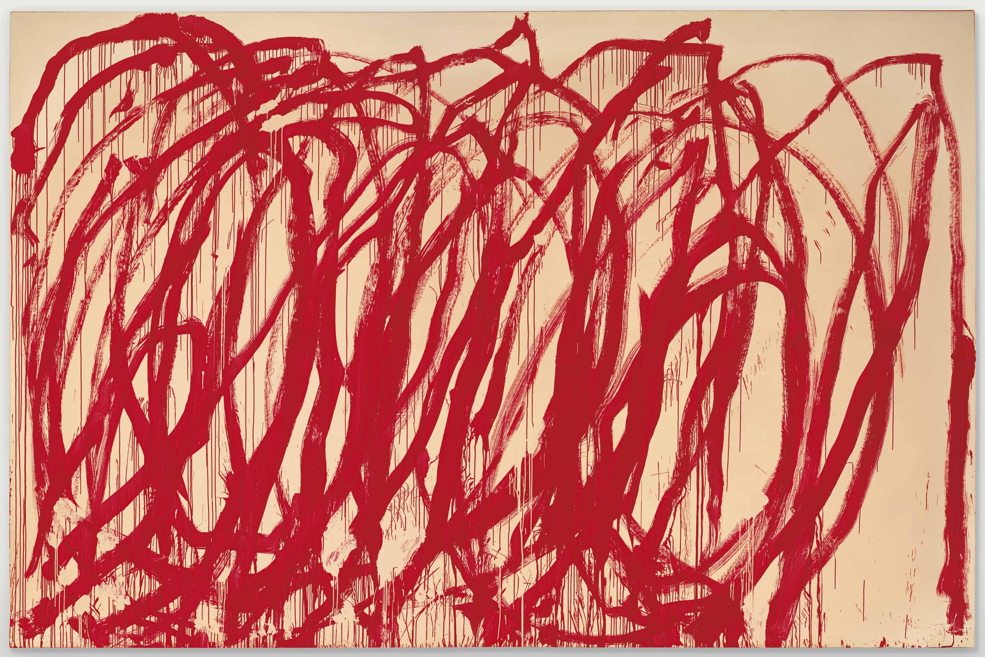
Cy Twombly
Untitled, 2008
LINE
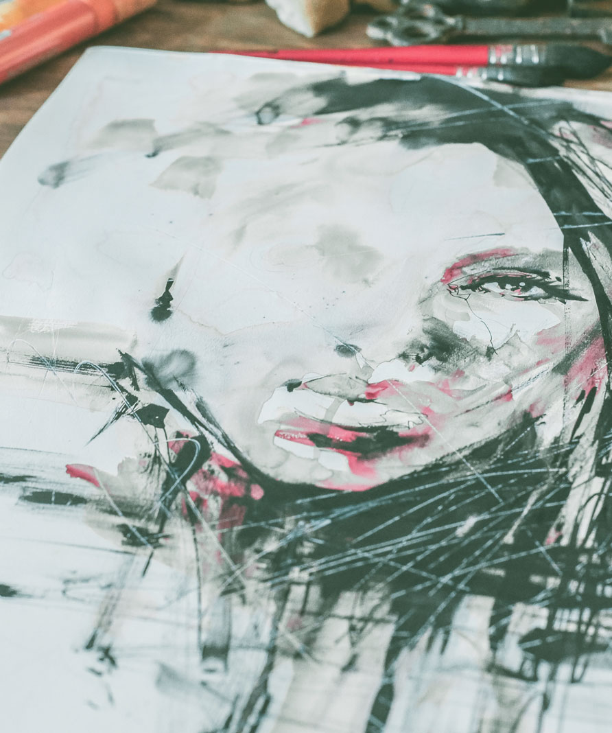
So, let us first look at LINE. A line can express incredible things! A jagged line might suggest anger or frustration or pain. A delicate, wandering, fading line might evoke loss or sadness. A smooth, curving line might awaken a sense of sensuality or desire. Lines made in quick succession might indicate movement or confusion. I could go on and on. Your marks matter. I’m not saying each line must be pre-conceived or be given a specific job but consider what you are trying to express and see if you can let that flow through you into your mark making. Feel it in your body and let it show upon the page.
“Line is a rich metaphor for the artist. It denotes not only boundary, edge or contour, but is an agent for location, energy, and growth. It is literally movement and change – life itself.”
– Lance Esplund
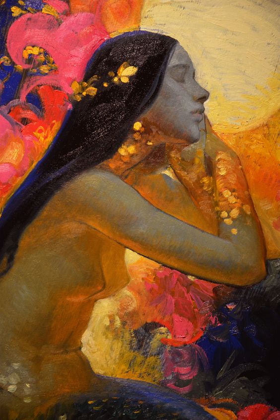
Victor Nizovtsev
COLOR
Color is one of the most potent of these elements and its appearance in your work is pivotal. A drawing can go from placid to powerful with a splash of color. A mood can become heavy or light depending on the hue applied.
We have an intense relationship with color and it is heavily anchored in both symbolism and emotion. Within color lies layers of subtly and suggestiveness. Color has stories intertwined into its meanings. Color has history. In one culture, Red may mean lust while in another, good fortune. Green may suggest jealousy or abundance. Yellow, the sun or cowardice. Here, the artist gets to choose how to weave color into her work. Your relationship to blue may not mean sadness but rather peace – to convey this message you will choose other elements to further echo this meaning. I.e. you may choose smooth, curving lines, soothing shapes, a harmonious composition. These elements, when paired with your blue begin to evoke the peace you are expressing.
“A color is as strong as the impression it creates.”
– Ivan Albright
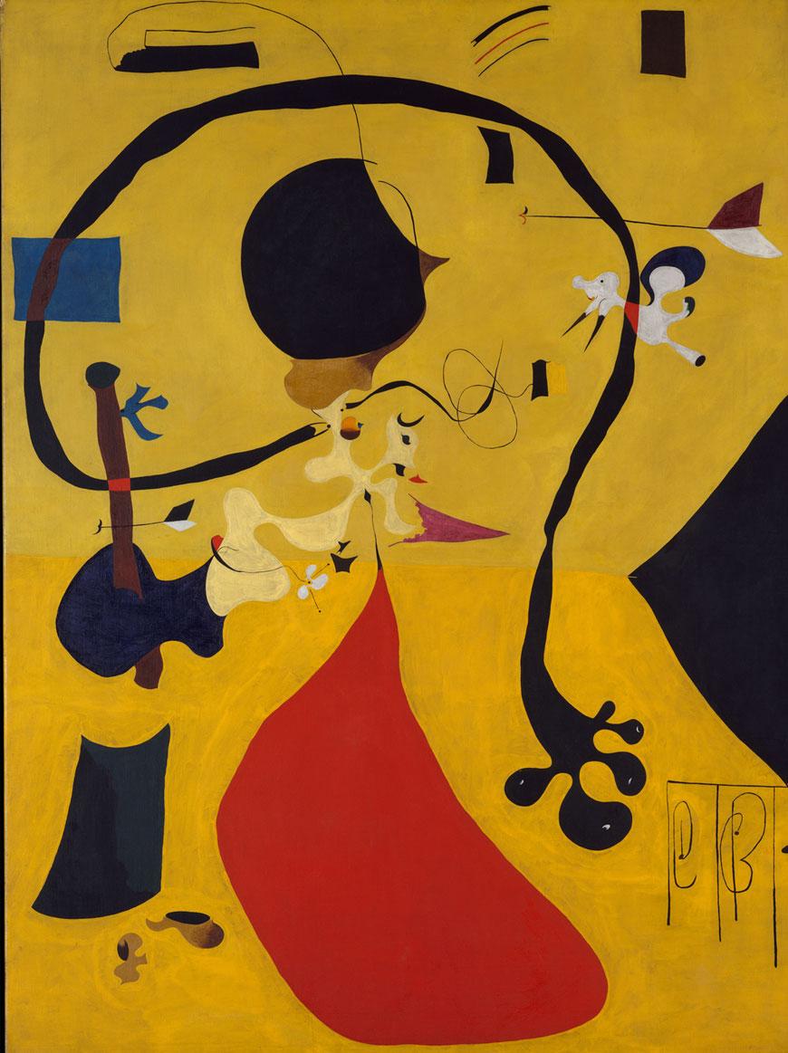
Joan Miró
Dutch Interior (III) 1928
SHAPE
The shapes we choose are like the words a writer selects to compose a paragraph. The shapes you create further the expression and tell part of the story. Are the shapes straight edges and rigid or are they organic? Are they voluminous or slender? Are there many shapes in your composition or just one strong shape? Shapes begin to build the structure of your piece. Shapes suggest forms. Just like the clouds in the sky, our mind will try and make sense of them and find something to recognize. I.e. tiny round shapes might be viewed as bubbles or jewels, sharp, angled shapes might recall man made structures. Consider what roles the shapes you use take on and how they play into your expression.
“I found I could say things with color and shapes that I couldn’t say any other way — things I had no words for.”
– Georgia O’Keeffe
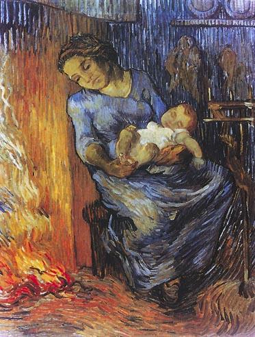
Vincent van Gogh
Man is at Sea, 1889
FORM
As mentioned above, shape alludes to form. A circle becomes an apple, a rectangle a house. In Realism we see these things realized through different applications of perspective, shading, lighting etc. In other expressions of art such as Impressionism or Expressionism these forms might be ambiguous or suggestive. Or they may be abstract, fragmented or obscured. It is this kind of art that beckons a closer look – a longer time spent gazing at the piece and wondering what is being conveyed. Although, it is important to note that realism can hold its own hidden meaning and secrets. Is that house on a hill just a house on a hill? Or does it suggest isolation, or loneliness? What it means to you as the artist may mean something else entirely to your viewer and in that, is the magical power of image.
“An illustrational form tells you through the intelligence immediately what the form is about, whereas a non-illustrational form works first upon sensation and then slowly leaks back into the fact.”
– Francis Bacon
Michael Carson
VALUE
Hint: Are the colors confusing you? Take a photo of your work and turn it black and white. Then observe what you look at first.
“In painting, as in life, you can get away with a great deal as long as you have your values right.”
– Harley Brown
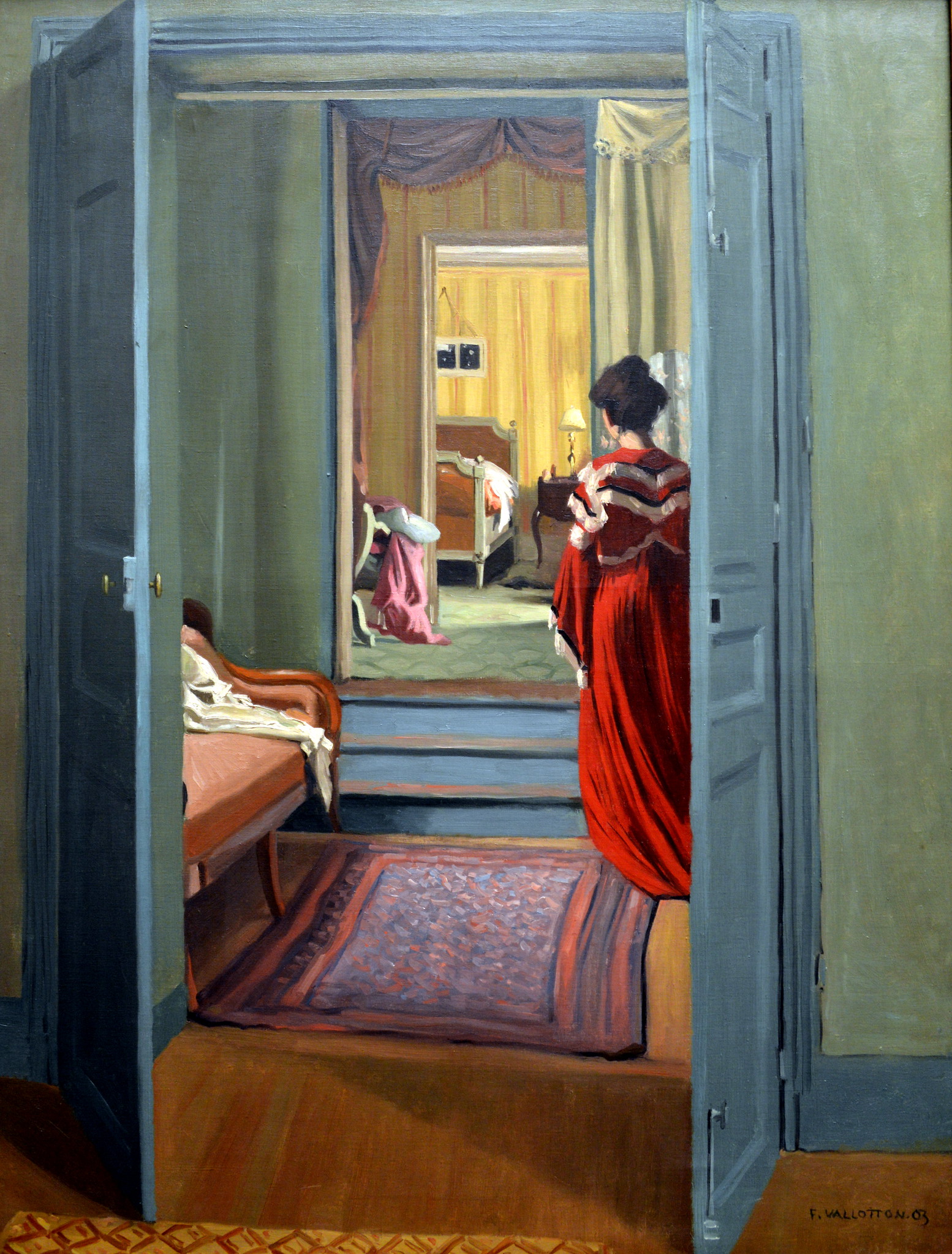
Felix Vallotton
Interieur avec femme en rouge de dos, 1903
SPACE
“I like the idea of blank spaces and that they get filled. I also like blank spaces that are allowed to be. Some kind of creative tension arises from the nothingness.”
– Sandra Geller
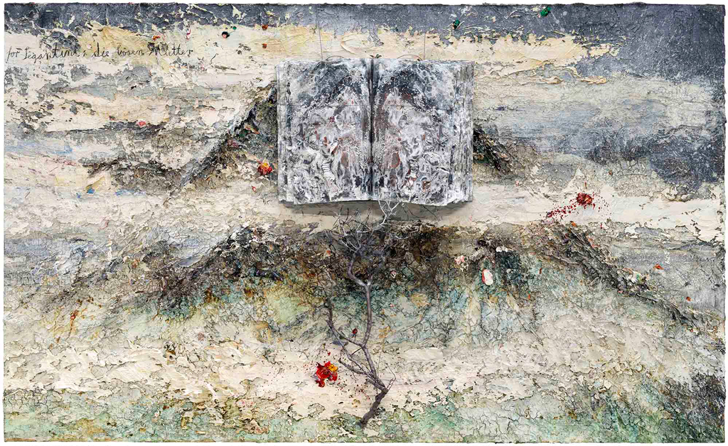
Anselm Kiefer
For Segantini: The Bad Mothers, 2011–12
TEXTURE
“If the painter has a good sense for the feeling that is to be conveyed in the painting, it will be easy to select the right texture to work with it.”
– Stephen Quiller
The Language of Expression in Art
EXPRESSION PROMPT:
- In your sketchbook, think of an emotion and then draw a line that expresses that feeling. Practice this using different mediums and mark-making tools, i.e. try ink, pencil, charcoal, pen then try making marks with a stick, or an old paintbrush or a piece of string.
Expression Observed
Now look at these three works and jot down what you see in relation to the 7 Elements we have discussed. Make simple observations like, used red or large shapes but then dig a bit deeper. How does the piece make you feel? Why? How has the artist achieved this? Learning to decipher other artworks will help you choose the way you interact with your own art and can strengthen the choices you make when creating.
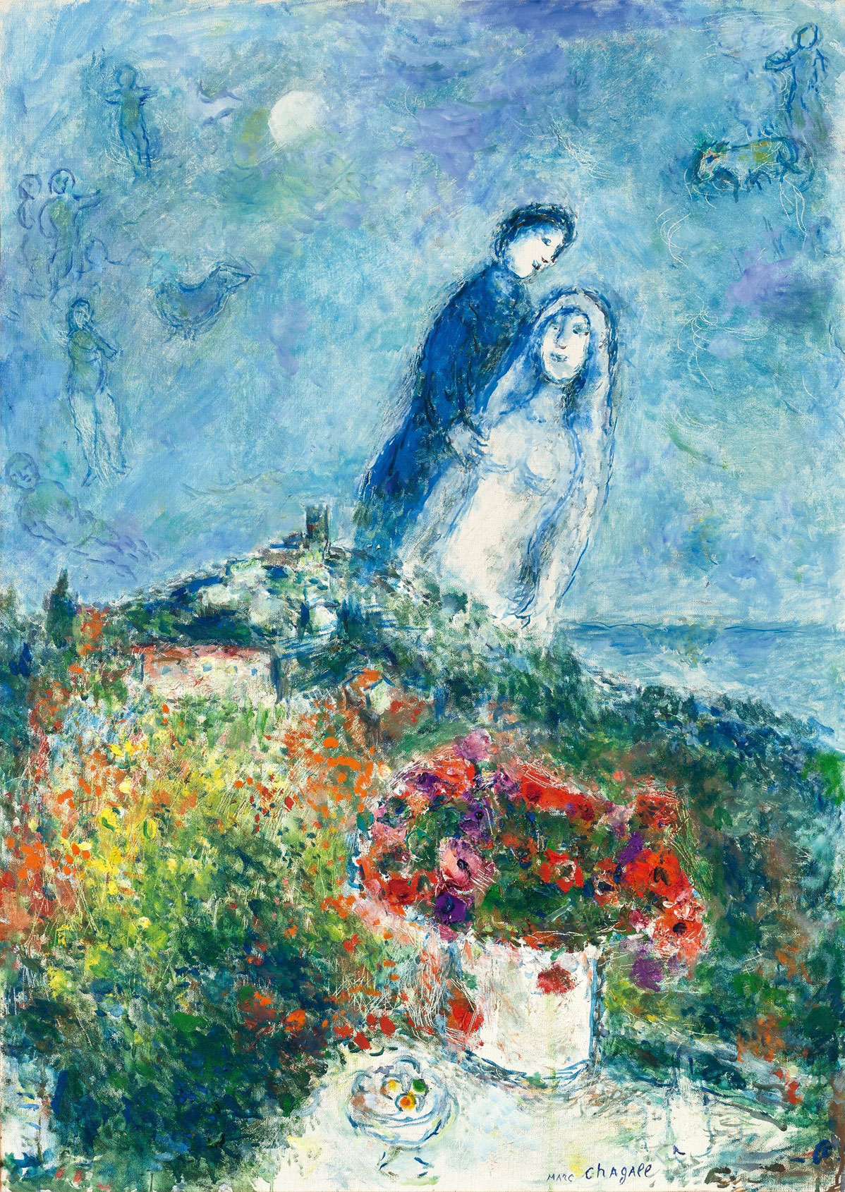
Les fiancés aux anémones
1979 – Marc Chagall
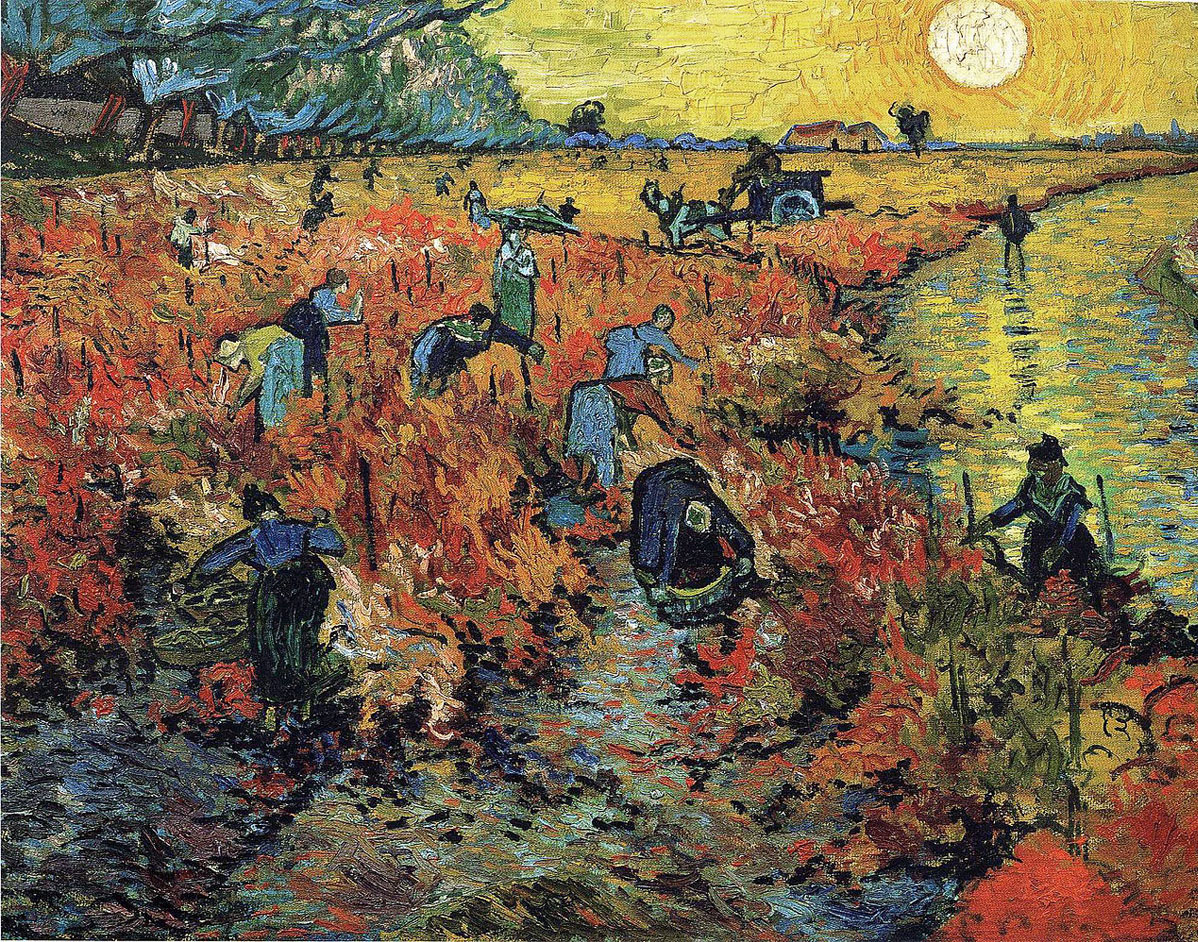
The Red Vineyards at Arles
1888 – Vincent Van Gogh
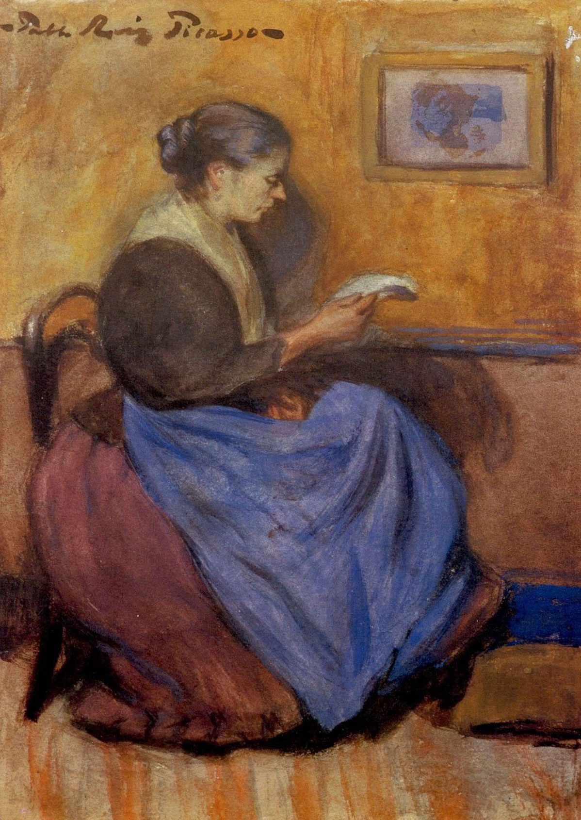
Mujer sentada leyendo
1899 – Pablo Picasso
I’ll do the first one with you…
Expression Observed
LISTEN CLOSELY
Being Receptive
You may have quickly selected the red paint and slashed in on your page and then you might wonder – “Oh why did I do that?” Before you jump to judgement or criticism, first explore the apparent question at hand – “What are you feeling?”
Perhaps you intuitively create a pool of white paint and watch it drip down the canvas. Why? What does that feel like?
Maybe you emphasize the curve of the neck on the woman you are drawing…or pay special attention to make her delicate chin have a strong edge. Why? Perhaps you are connecting to her vulnerability or her determination.
I don’t suggest that you interrupt your process with constant questions but these things are worth considering after creating or in the moments where you feel stuck. I promise there are messages just for you within your work.
Have conversations with your work. Ask it questions and then listen.
“What are you telling me?”
“What do you need from me?”
“How are you making me feel?”
This may sound strange but I’m sure many of you can relate, since artists have been doing this since the very beginning. Remember, that while you have something to say ….your art WILL add to the conversation.
Be receptive when creating. Keep your eyes, ears and heart open.
“The painting leads the painter.”
– Ardath Davis
Listen Closely - Being Receptive
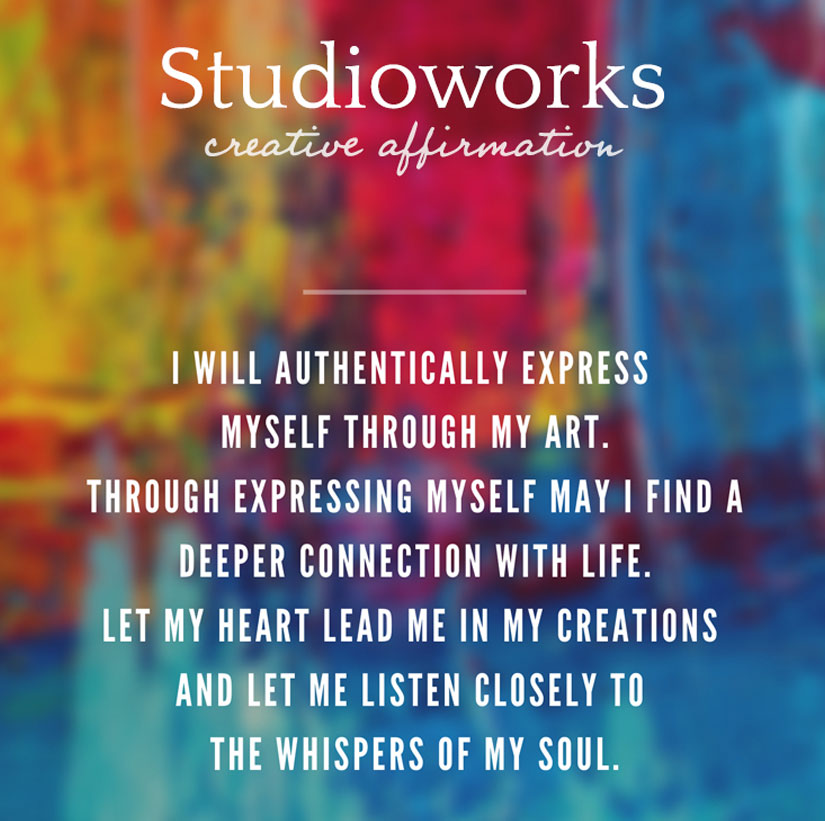
Monthly Affirmation
join us in the
Studioworks
creative academy
Save up to 40% OFF – Limited time offer
Find creativity that fits your goals, mood and experience level anytime! With over 200 CREATIVE CLASSES, meditations, creative journals and more, you’re sure to find the right class at just the right moment.
Inside Studioworks, there’s an amazing creative community waiting to guide and support you along your creative journey!
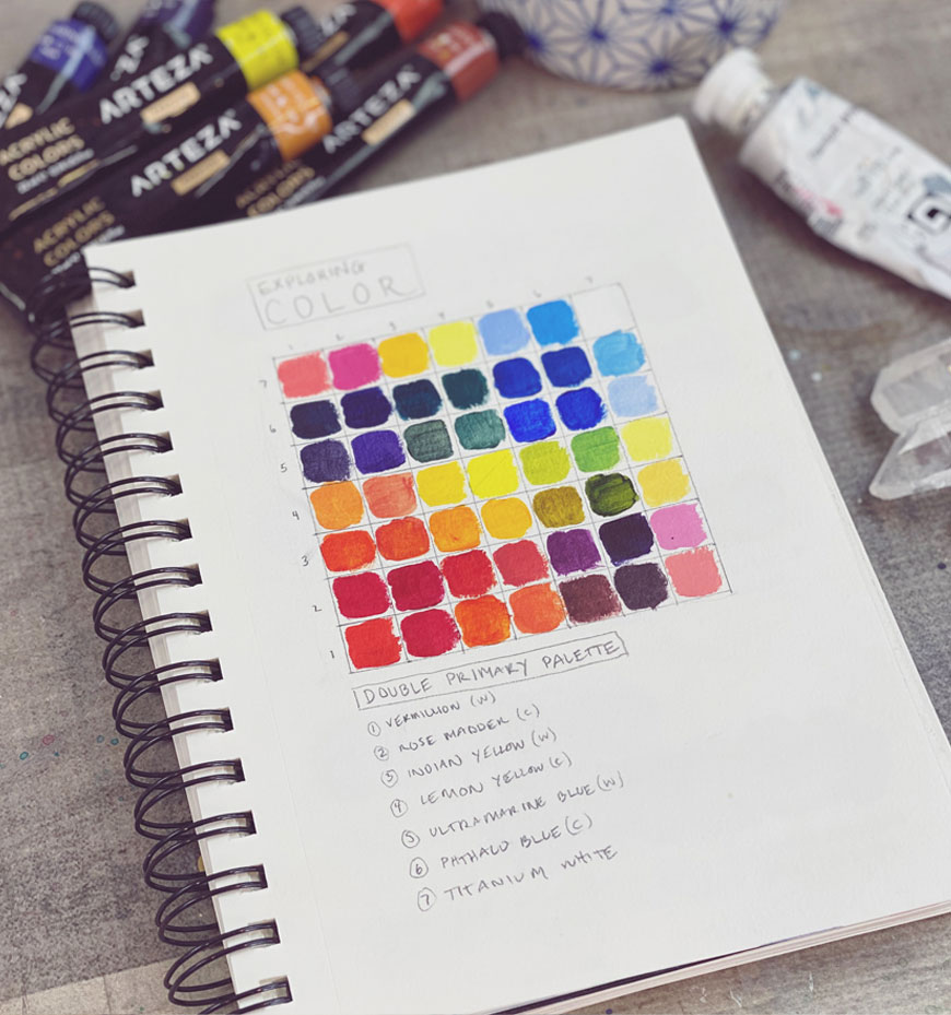
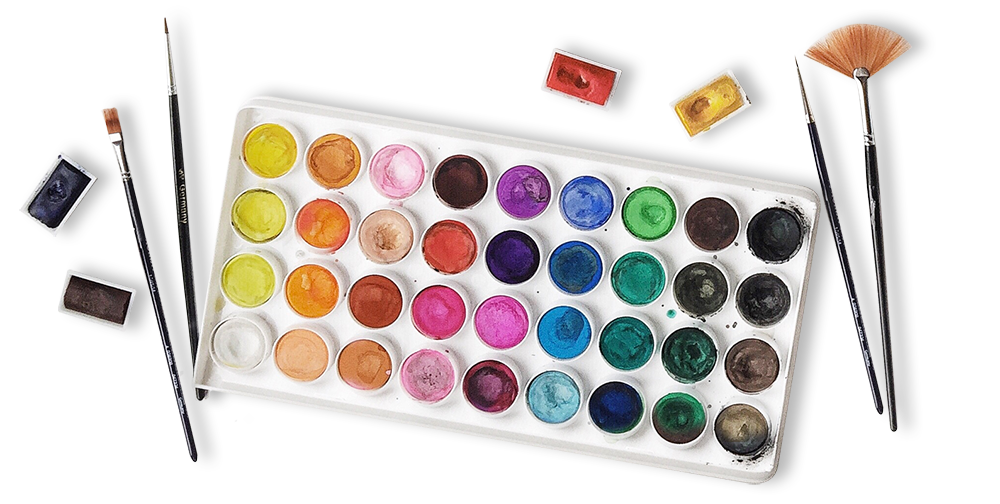
Color Palette of the Month
Before I go on, Primary colors can be rather controversial and there are many opinions. Scientifically, red, blue and green are the primary colors of light. Since these are the colors we see with our eyes but as children we learned that the primary colors are yellow, red and blue. This is related to paint – not light waves. So let’s get that clear. 😉 As far as what paints are the TRUE primaries…even this is argued.
I feel that going back to the primaries is a great way to explore emotion and color. When we think of Red we have some immediate associations and the same goes for Blue and Yellow. Of course, the variations of these hues can alter our associations too. The blue of the ocean might make us think of vastness or depth or despair whereas the blue of the sky might suggest happiness or hope. Of course mixing these primaries is great color practice too!
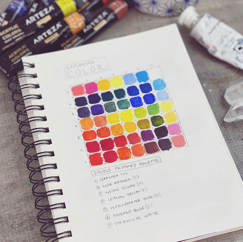
For our purposes, we will be trying a double primary palette. We will use two blues, two reds, two yellows. One of each will be warmer while the other cooler. From this palette you can mix almost any color you could want! See a list below of these! Remember to try and use what you have.
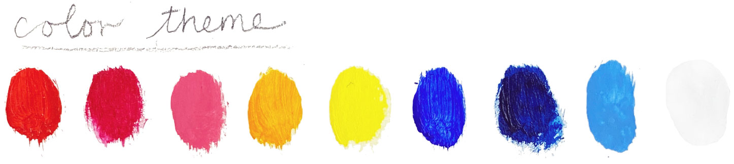
Cool Reds (bias toward purple)
- Alizarin Crimson Permanent
- Permanent Rose
- Anthraquinoid Red
- Permanent Rose
- Quinacridone Rose
Warm Reds (bias towards orange)
- Cadmium Red Light
- Cadmium Red Medium
- Naphthol Red
- Pyrrol Scarlet
- Cadmium Red
Cool Yellows (bias towards green)
- Lemon Yellow
- Cadmium Yellow Light
- Hansa Yellow Light
- Transparent Yellow
- Nickel Azo Yellow
Warm Yellows (bias toward orange)
- Cadmium Yellow Deep
- Hansa Yellow Deep
- Indian yellow
- Quinacridone Gold
Cool Blues (bias towards green)
- Phthalo Blue
- Prussian Blue
- Cerulean blue
- Manganese Blue
- Winsor Blue
Warm Blues (bias towards purple)
- Ultramarine Blue
- Cobalt blue
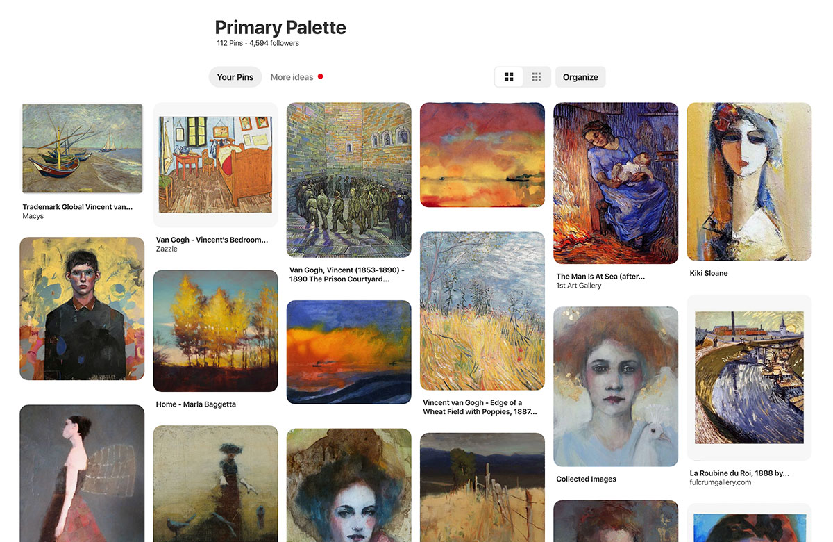
To further explore artwork that uses a primary palette, check out the Pinterest board I created for you – Primary Palette –
“Color is all. When color is right, form is right. Color is everything, color is vibration like music; everything is vibration”
– Marc Chagall
Color Palette
EXPRESSION PROMPT:
- Make a list of emotions, then sketch a shape that connects to each emotion. What shapes come up for you? Why? Make some notes about this in your sketchbook. Don’t overthink this.
MASTER ARTIST GUIDE
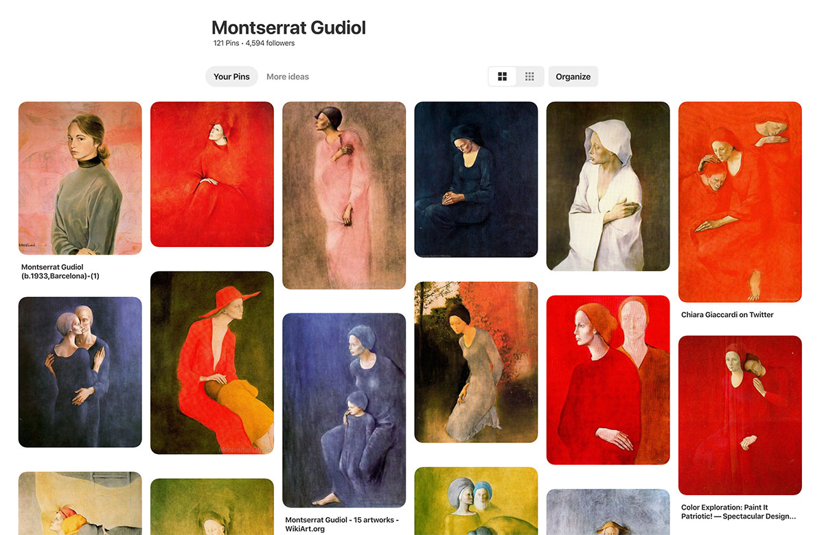
Montserrat Gudiol
Guidol’s restrained use of color doesn’t make her paintings dull, but rather the finite hue choices echo emotion as though her figures are completely engulfed in a feeling and that feeling is expressed through color.
Many of her pieces remind me of Picasso’s blue and rose periods. Ethereal and often slightly elongated, her figures are classical and universal. Long fingers and hands further emote alongside graceful gestures and refined faces full of expression.
LET’S LEARN A LITTLE MORE ABOUT THIS ARTIST:
Montserrat Gudiol was born in Barcelona in 1933. She was the daughter of the architect and art historian, Gudiol Ricart. In 1950, she studied restoration of old paintings and focused specifically on painting on wood and paper. She travelled to Spain but also to South Africa, the United States, Russia and Canada. In 1981, she became the first woman admitted to the Real Academia Catalana of Fine Arts in San Jordi. In 1998 she received the Cross of St. George.
(source WikiArt.com)
I’m sad that I was not able to find out more about this artist! She only recently left us, in 2015 so hopefully more will be written about her as time goes on. Her work touches me deeply. I hope you will enjoy studying it with me this month.
Here’s a Pinterest board full of her work to inspire you!
I encourage you to take a peek and consider creating some Master studies this month.
“The artist is a receptacle for emotions that come from all over the place: from the sky, from the earth, from a scrap of paper, from a passing shape, from a spider’s web“
– Pablo Picasso
Master Artist Guide - Montserrat Gudiol
Sketchbook Explorations
Our sketchbook theme this month is Emotion and color. Since we are focusing on self expression, it only makes sense that we explore emotion and color in our sketchbooks. It is wonderful to discover how YOU express yourself through mark making, color, subject matter and more. So let’s dive in.
Please remember, our explorations in our sketchbook are really just access points to get you into the flow. However, they can also be seeds for new ideas, concepts and themes in your art. Some of them will be more about writing and others more about drawing and painting. You will see below three prompts and exercises explained and photographed from my own sketchbook. You are welcome to expand upon, invent and experiment with your own concepts too. Use our color palette if you want to. You will see I stay in that theme for my explorations. These may feel silly at first but let your inner artist play.
EXPLORATION 1
Color Chart
To further enhance your ability to express yourself in your work it helps to practice your color mixing. Using the double primary palette I mentioned above, create a color mixing chart and mix as many colors as you can. Then jot down what each color makes you think of and any emotion tied to it. You can read about color theory all day long but the best way to understand color mixing is to MIX! So really dig into this and pay attention to how colors affect each other! You will see that our double primary palette mixes a TON of colors!
Please enjoy this video further exploring this topic:
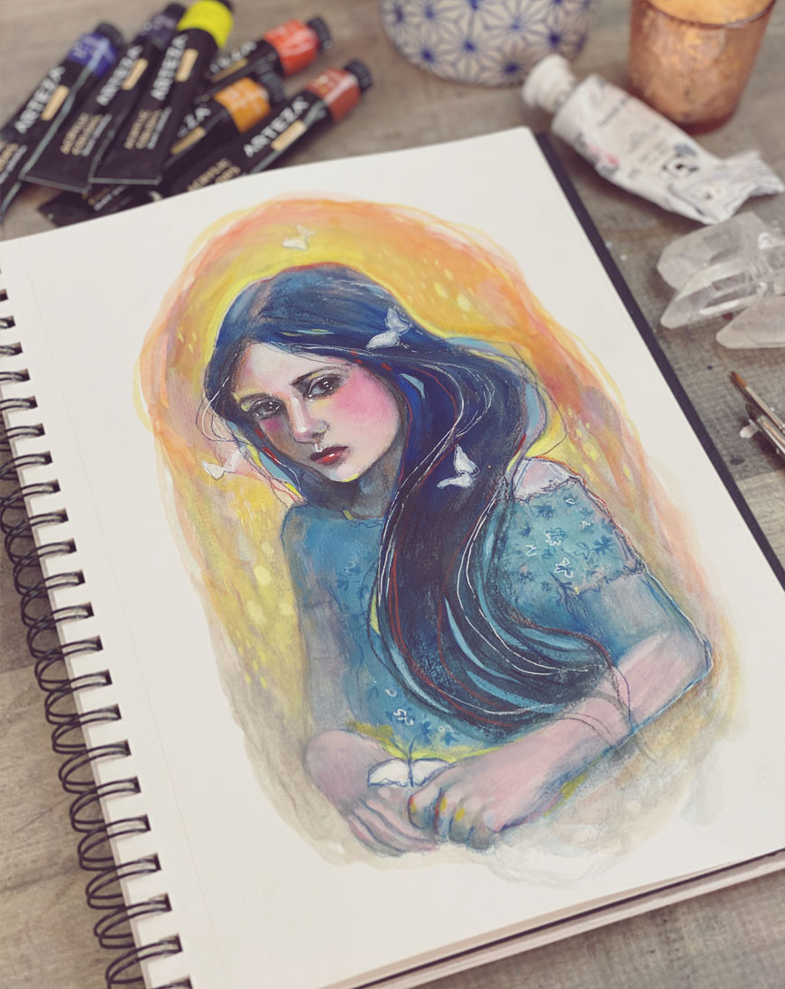
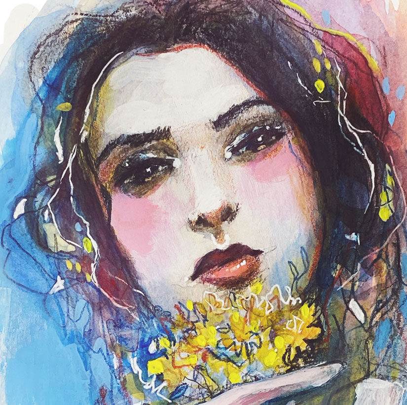
EXPLORATION 2
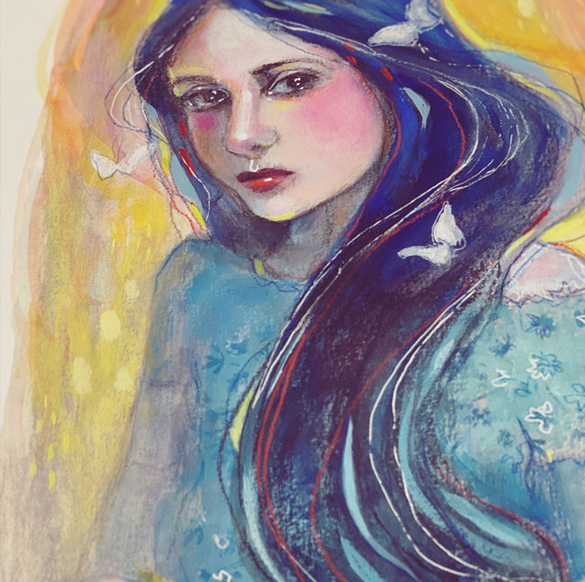
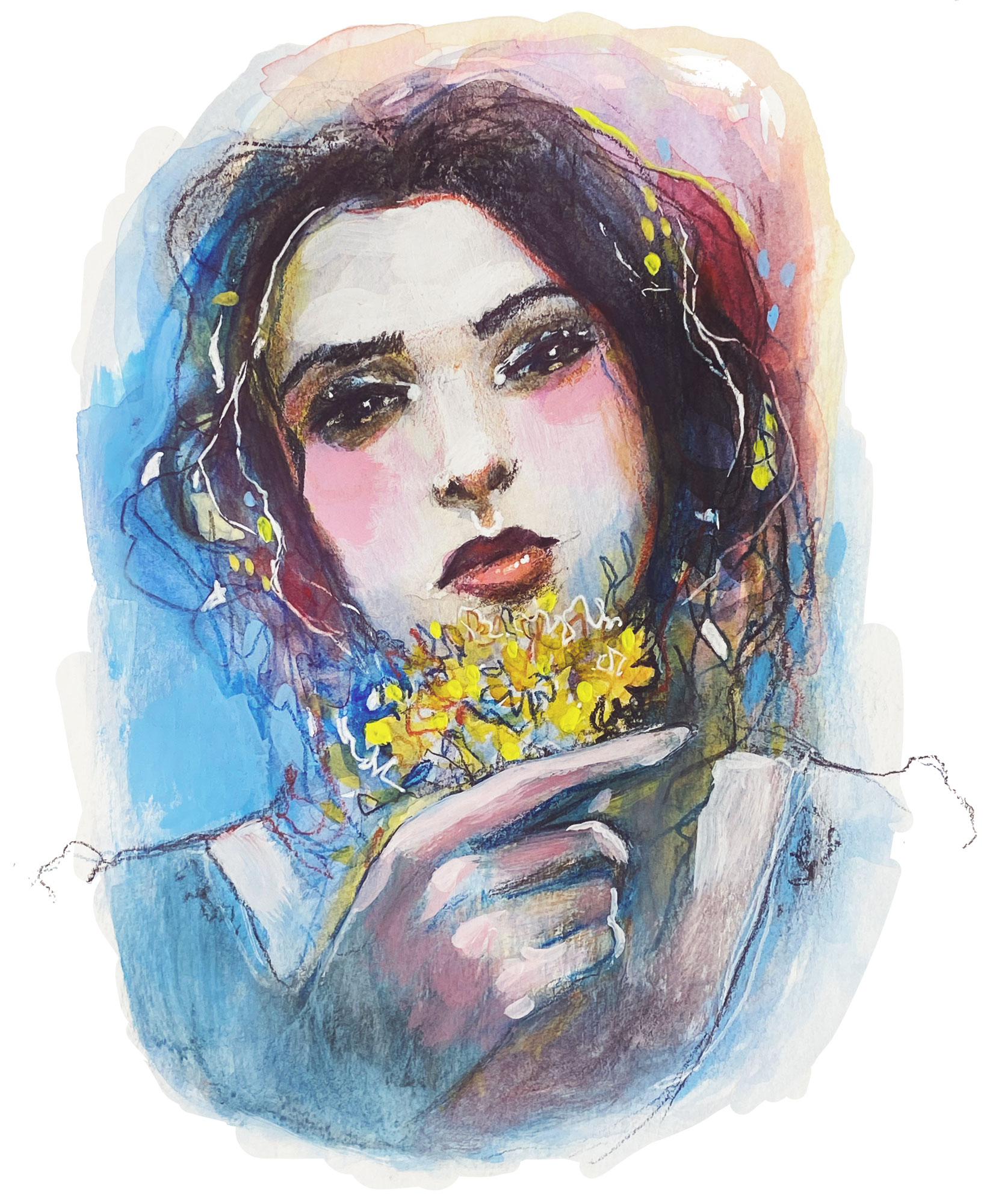
Primary Portrait
Create a portrait using our double primary color palette. Explore the colors and enjoy this process. Also, experiment with expressive marks and line work. Think about what you are trying to emote and discover what colors and marks align with that feeling. (You will see me complete this exploration with you in our Lesson Video this month.)
EXPLORATION 3
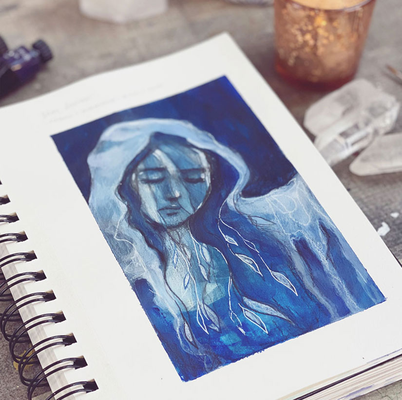
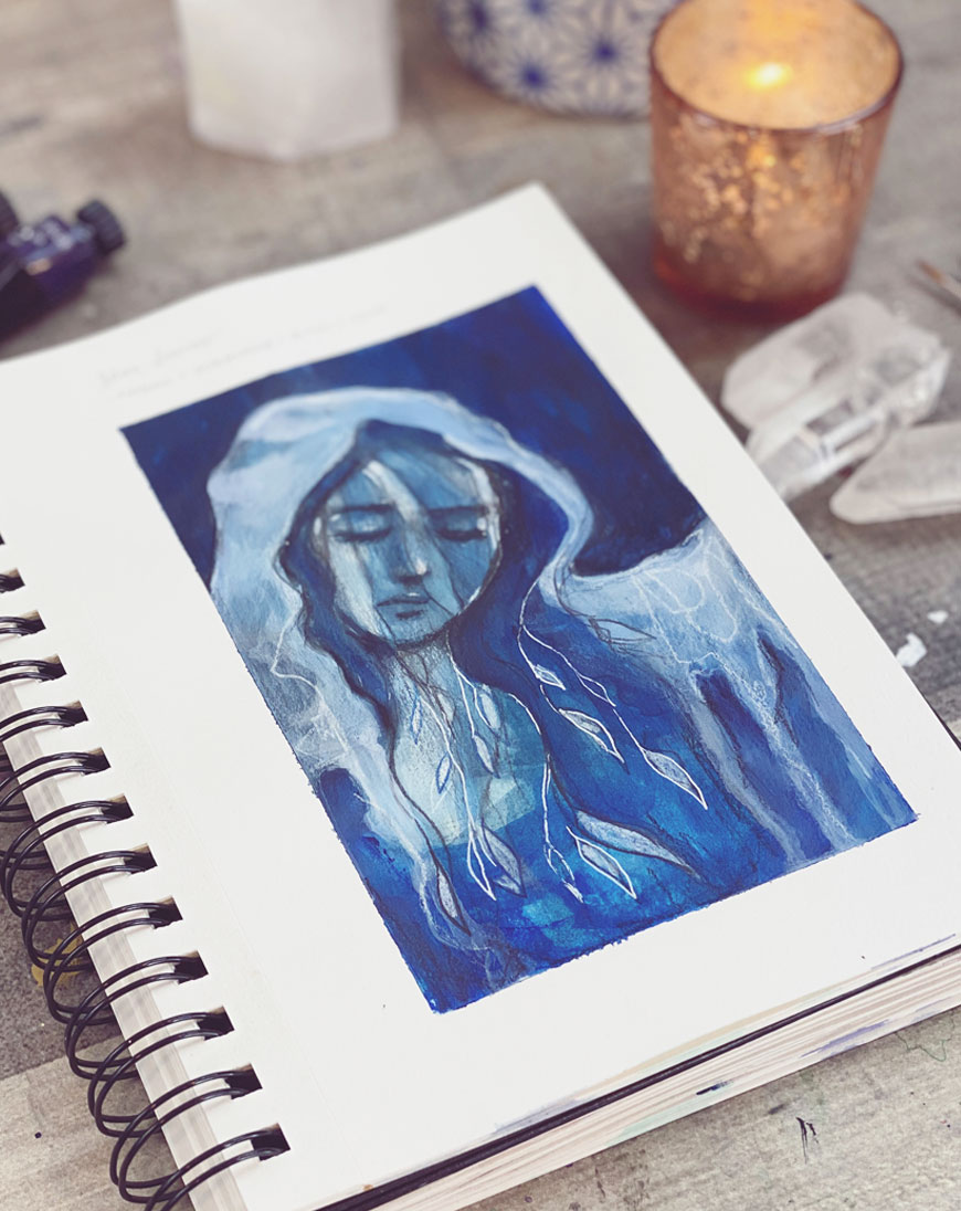
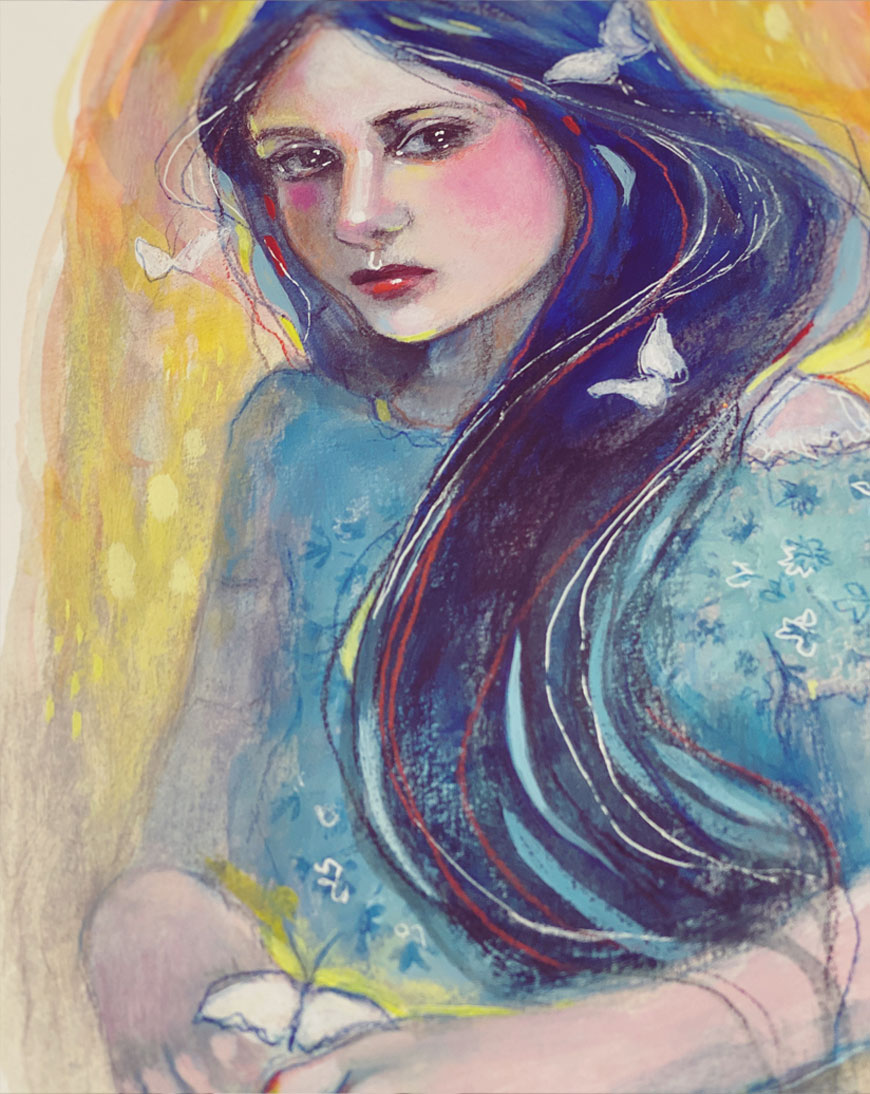
Emotive
Pick an emotion or feeling. Create a page dedicated to it. Using the 7 Elements of Art we previously discussed, create a sketch, painting or collage with the essence of this emotion expressed. This could be literal or very abstract. Do what FEELS right to you.
For my exploration, I chose blue and the feeling of sorrow.
Did You Know?
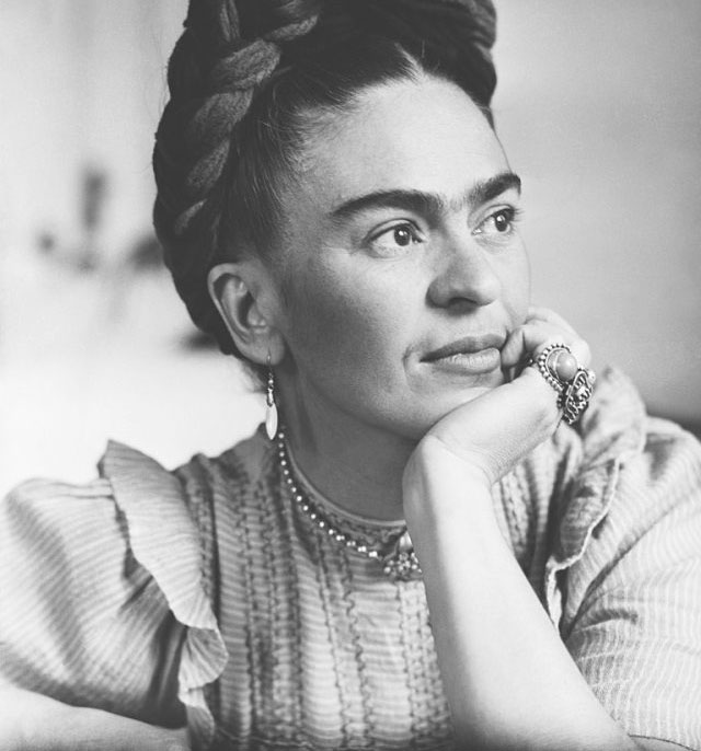
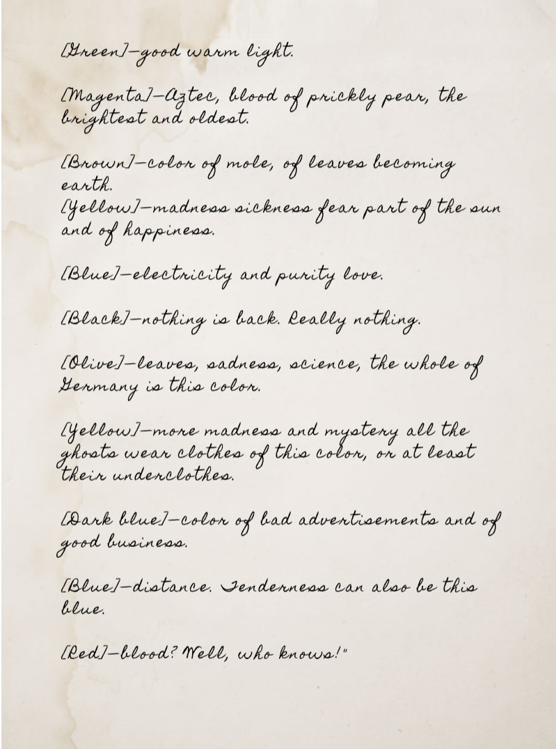
Frida Khalo created associations, memories or feelings to color and jotted them in her Sketchbook…
What do colors mean to you? What memories, images and feelings do they invoke?
MONLTHLY ART PROJECT
Primary Portrait
Have fun exploring this palette and your connection to these colors! Play freely with both the color and your linework and mark making. Really feel into this work. Focus on what you are trying to express with your portrait and then follow that feeling with your brush work, colors and marks.
STUDIOWORKS PODCAST
issue fourteen
You can also listen to this month’s issue of the Studioworks journal. I find I love listening to books, podcasts and music while I draw, paint or go on a long walk. Enjoy.
Studioworks : issue fourteen
join us in the
Studioworks
creative academy
Save up to 40% OFF – Limited time offer
Your Studioworks membership unlocks full access to over 200 CREATIVE CLASSES and so much more. No more waitlists or wishing you could join a class.
Plus, you’ll receive UNLIMITED ACCESS to every issue of the Studioworks Journal. Each month you will be supported in your creative journey through teachings I will be sharing with you inside. This specially crafted online magazine will be packed with inspiration, guidance, creative prompts and sketchbook explorations.
inspiration: curated
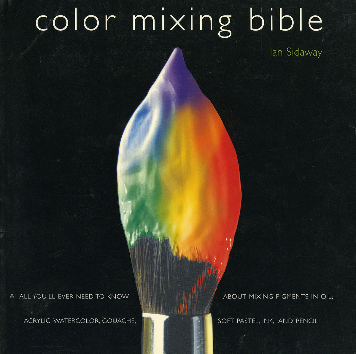
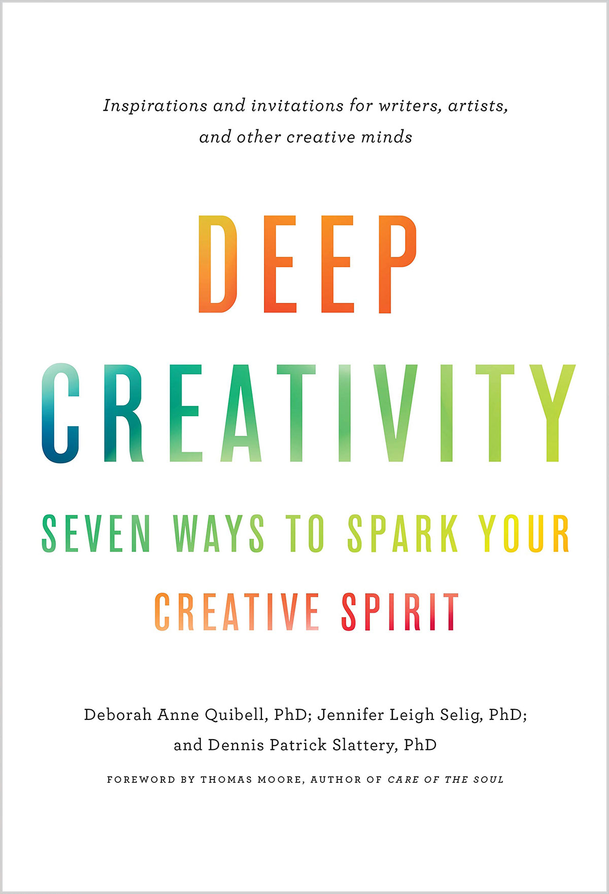
BOOKS FOR CREATIVE SELF DISCOVERY
& EMBRACING NEW BEGINNINGS
MUSIC PLAYLIST
I had so much fun curating this list. I hope you enjoy!!
PINTEREST BOARDS
FAVORITE SUPPLIES THIS MONTH
CLASSES TO TRY
These classes carry joy filled learning rooted in nature, art and happiness! I highly recommend checking them out if you haven’t already. Enjoy!